Hey guys, I wanted tos hare with you a nice little addon which makes auctioning of items you sell a lot, such as glyphs, consumables, or trade goods, incredibly easy. This addon is Quick Auctions. What it does is check the price of the item and posts yours undercutting the competition, as long as the price is over a certain amount. What makes this great for glyphs is that it will quickly check to see if you have been undercut and cancels your auction so you can go back and repost it lower than your competition.
You can find Quick Auctions here
The only real downside I have found with quick auctions is that it requires /commands to set it up.
However to combat this problem there is a very simple guide over at the justmytwocopper.blogspot.com forums about setting it up for the glpyh business, but can also be applied to many others. This guide can be found here
Saturday, July 11, 2009
Monday, July 6, 2009
Reader UI: Mygda
Hey guys, Valrot here with another interface for you guys to take a look at.
This week we have Mygda's interface, the cool thing about Mygda's UI is well it is so completely different. You see most of the usual interfaces, many of which look similar to blizzard's default or similar to mine, Mygda completely broke free of the usual for his UI. Before you go screaming anything about not liking it, you need to read what he has to say showing why his UI is built the way it is.
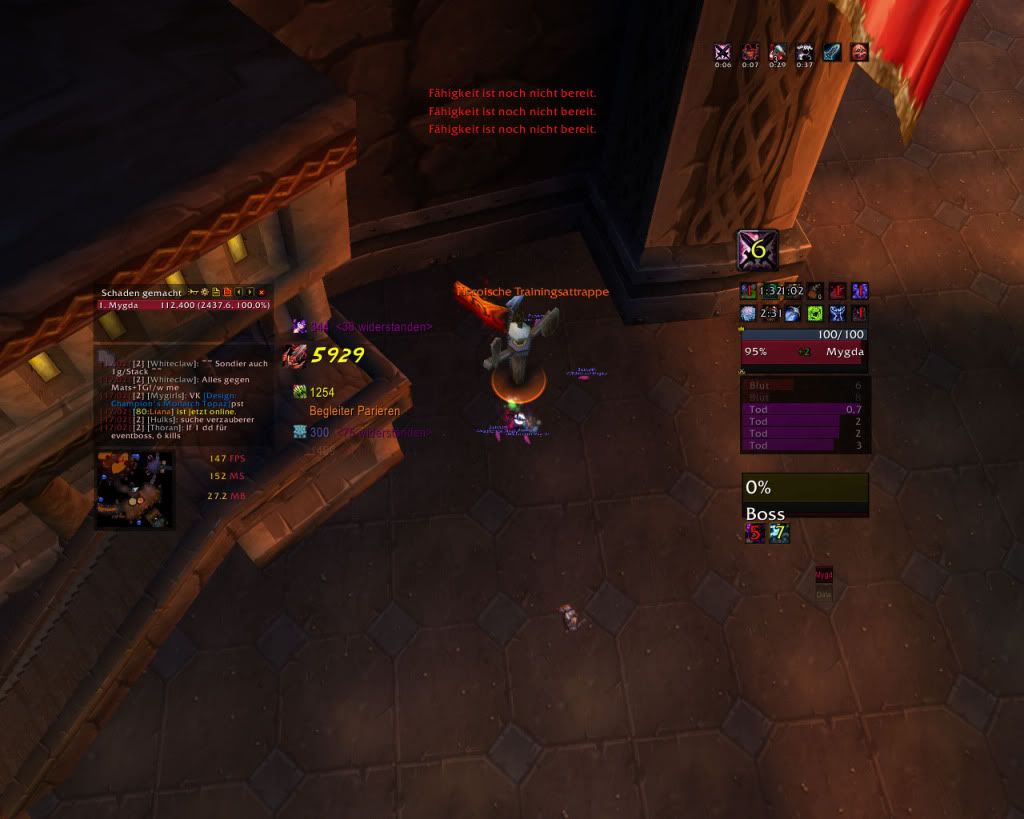
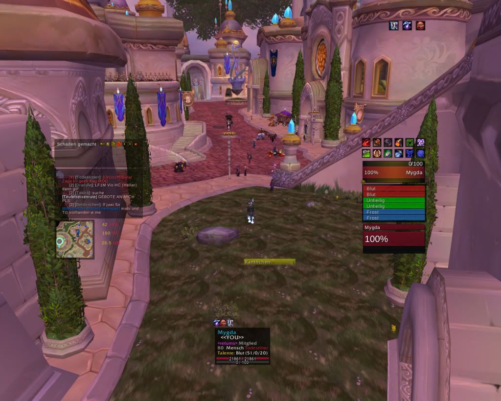
"After i took a look at zupa's UI and with the intention to improve the discussion about "a good and welldeveloped interface" I would also like to share my ideas. first, you can have a look at my dk's UI (appendix). I know it looks a bit strange and totally off of the ideas behind common interfaces. but let me explain my thoughts behind this: overall, i want a very minimalistic one (love those). at the same time i want all necessary information (linke omen, player and target frame, proccs) on a place where i can find them quickly. so i did a few tests on myself and found out that your eyes are in the middle of the screen in most of the time. so i put all these data to the middle. next step, i read some articles about the brain and how your two halfs works together and so on. there i found out that clear data is best recognized on the right side of your view. so i put all important data (like player/target frame, omen, rune bars) on the right side. the not important ones like chat frames and minimap are also placed in the middle, but left hand side. the result of these observations you can see in the picture. my main attacks (aren't that much for dk pve) are used via keybindings and placed on a hidden action bar. the bars over the player frame are trinkets/pots and on-click attacks like dancing rune weapon for example. also i'd filter target's debuffs and only represent my deseases. boss has just the hp perventage (the rest is displayed via the tooltip window^^) party frame is normaly in the lower right corner, more to the bottom (as a dk dd u don't really need them :p )"
And here is two pics showing off Mygda's UI:
Mygda's UI is using:
AG Unit Frames
Bartender 4
Bison
Button Facade (with the Caith-skin)
Chinchilla
Debuff Filter (so you have nearly the same debuff effects like with xperl)
eePanels (so every frame is fully transparent with a panel in the background^^)(unfortunately i don't get kgpanels yet :/ )
Evil's Name Plates
Grid
Different Ace-Libs (i.e. SharedMedia for using my own fonts^^)
Magic Runes
MSBT
Omen
Omni CC
Prat
Recount
Recipe Known
Rating Buster
Stat_Block (FPS, Memory, Latency, sometimes Folks and Clock too)
TipTac
Xloot
DBM (of course^^)
I think that Mygda's research proves not only the smart choices made behind his UI, but also shows that Mygda really thought about why parts of the UI are placed where they are. Hope you guys enjoy this tangent from the normal. What do you think of this completely different design for an interface and the research made behind it.
Want to share your UI with the other readers? feel free to email me a small description as well as a screenshot of your Interface to mikemage2@gmail.com
Sunday, July 5, 2009
Moving
Hey guys, sorry for the lack of posts, this past week was full of me packing stuff getting ready for my family's move. I will have a post up tomorrow.
Subscribe to:
Comments (Atom)

